02 — before & after
drag to
compare
drag the handle left and right to reveal the original site vs. the redesign.
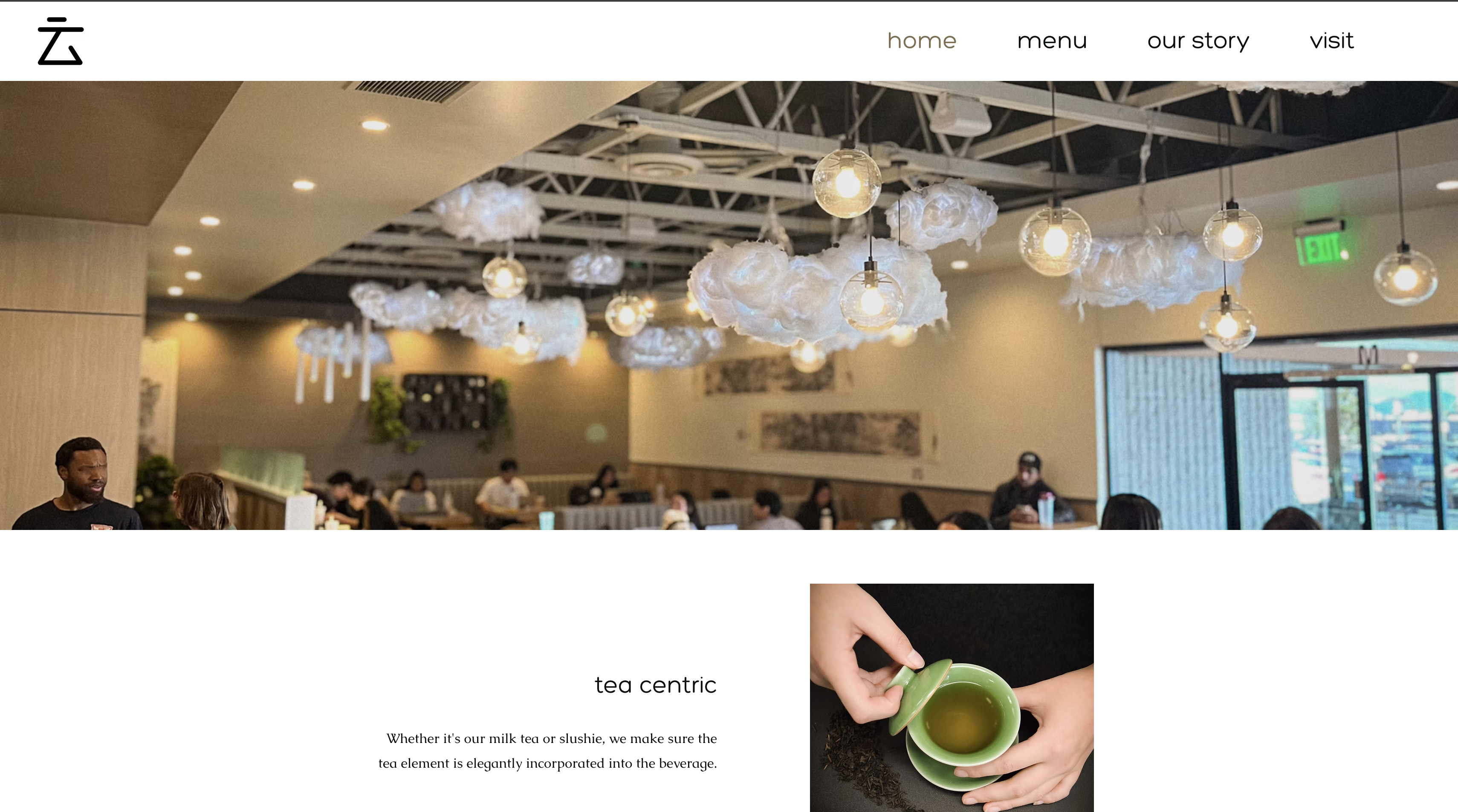
before
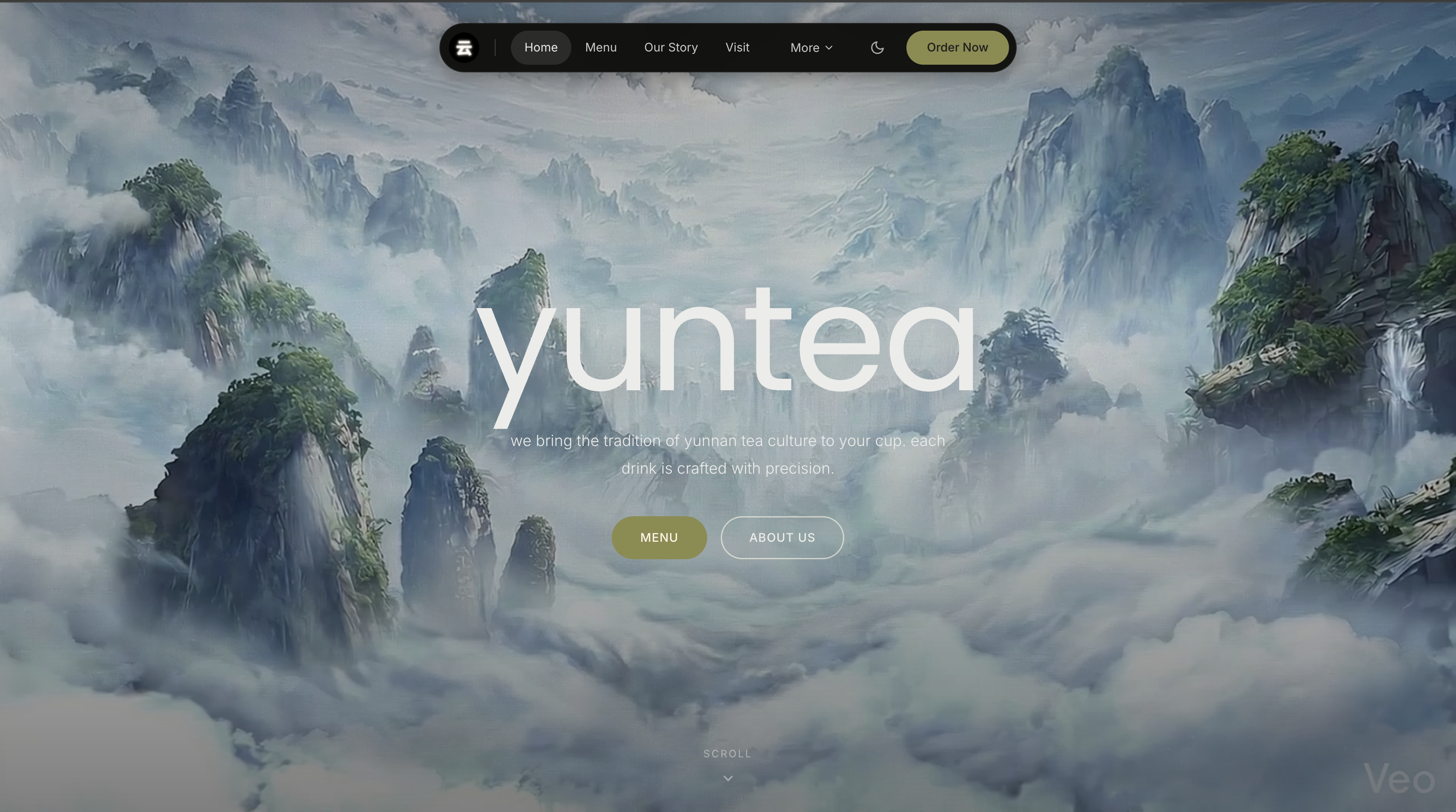
after
transforming a dated restaurant website into an immersive, cinematic brand experience — giving a local tea house the digital presence it deserves.
01 — overview
YunTea is a tea house in San Diego with a genuinely beautiful product — but a website that didn't reflect it. The original site felt generic, hard to navigate, and failed to communicate the brand's atmosphere.
This was an unsolicited redesign: I took it on independently to push my web design skills and explore what a hospitality brand's digital experience could feel like when it's built around emotion, not just information.
the original site lacked visual identity, used a cluttered layout, and gave no sense of the tea house's warm, elevated atmosphere. visitors couldn't easily find what they needed, and the site didn't inspire them to visit.
create a cinematic, brand-forward web experience that captures the essence of yuntea — serene, atmospheric, and rooted in craft — while improving clarity and flow.
dark, immersive aesthetic with editorial typography, full-bleed landscape imagery, and a simplified navigation structure. designed in figma, then built in HTML & CSS.
02 — before & after
drag the handle left and right to reveal the original site vs. the redesign.
03 — design decisions
swapped the original's busy white background for a deep black base with muted earth tones and warm gold accents. this immediately elevates the brand perception and sets an atmospheric tone that mirrors the calm of a tea ritual.
replaced stock photography with full-bleed mountain landscape imagery — evoking the origins of tea culture. the hero became about feeling, not just product listing. the tagline sits directly over the image for maximum impact.
introduced a bold, italic serif-style display font for headlines at large sizes, contrasted against a lightweight body font. this editorial pairing gives the site personality and communicates craft and intentionality.
collapsed the original's cluttered nav into four clear categories. reduced cognitive load so visitors can immediately find their way to the menu, the story, or a visit — without visual noise getting in the way.
structured the page to tell a story as you scroll: landscape → brand story → menu highlights → visit. each section transitions naturally into the next, making the site feel like a curated experience rather than a brochure.
subtle fade-in animations on scroll and a fixed parallax hero image add depth without distraction. the goal was restraint — motion should make the page feel alive, not performative.
04 — outcome
this project taught me how much restraint matters in brand-forward design. the temptation is always to add more — more color, more elements, more copy. but the redesign got better every time I removed something.
it also deepened my understanding of emotional hierarchy: the first thing a visitor feels should tell them exactly what kind of place this is — before they've read a single word.